
Visually, components are unique, flexible units to compose complete layouts. For content, they can trap reusable data into single-use decorations.
View in Sanity StudioUpdated 2023-11-28 | Published 2022-10-03
I had the opportunity to present and expand on this blog post as a conference talk at Future Commerce Finland 2023. See the talks list on my Speaker Profile page for more details.

Adopting the components model has allowed frameworks to empower developers to build a new class of websites and apps.
In design tools like Figma and Sketch, and code library choices like React, Vue, Svelte, Laravel and even native with web components – they are now the default way designers and developers compose interfaces.
For development, separating concerns into unique components helps isolate complexity. Individual parts of an application can be lazy-loaded, or on-demand. Especially with the rise of server components in React, any component — small or large — can be loaded into view and bring with it it's own unique, self-contained complexity.
Breaking designs down into components helps us drive visual consistency. All the variations of what a "Button" is can be defined in a design system. Then used all over an application with a predictable output given a set of inputs.
Which leads us to content. Typically, designers and developers visualise an entire application like a single image that first must be broken into puzzle pieces and reassembled. Then populated with content.
Components are composable and reusable.
As is structured content.
Problem is, components-first thinking can condemn reusable text and images into single-use decorations, arranged with explicit curation.
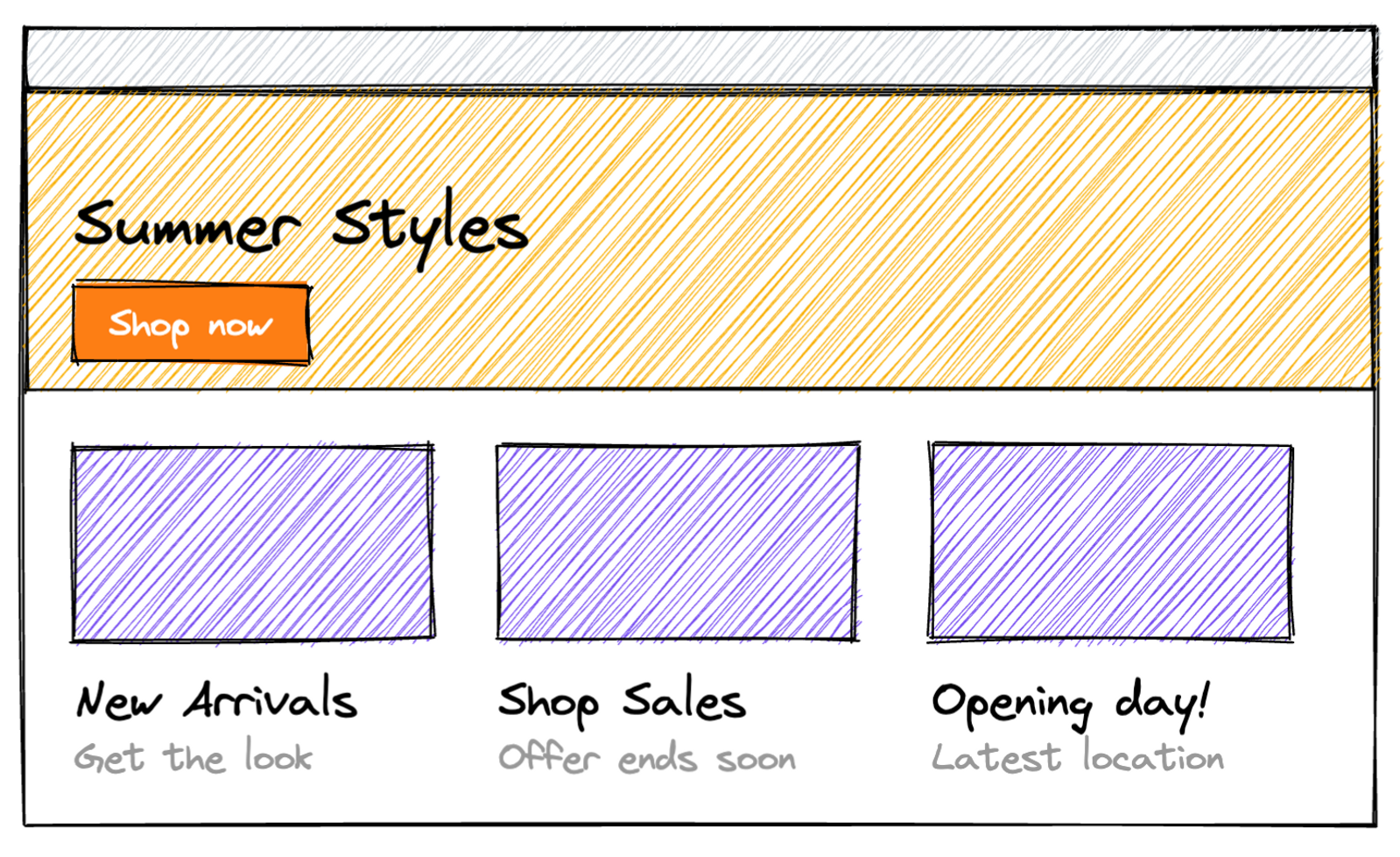
Consider this layout, it looks like most websites you’ve seen online, and you’ve probably been tasked with building something like this before:

Your first instinct could be to separate the top section into a <Hero /> component, and the row below into a <Grid /> of <Card /> components.
export default function HeroAndCards({ hero, cards }) { return ( <> <Hero {...hero} /> <Grid> {cards.map((card) => ( <Card {...card} /> ))} </Grid> </> );}This pattern is commonly referred to as a "Page Builder" and your authors will be able to choose, reorder and populate these "rows" or "blocks" of content.
Now imagine how you’ll configure your content editor of choice – shameless plug for the best platform for structured content – to populate these. We’ll want our authors to populate:
Content authored for these components comes from our imaginary API looking something like this:
{ "hero": { "title": "Summer Styles", "image": "https://cdn.image.service/summer-styles.jpg", "linkText": "Shop now", "linkUrl": "/shop-now" }, "cards": [ { "title": "New Arrivals", "image": "https://cdn.image.service/new-arrivals.jpg", "linkText": "Get the look", "linkUrl": "/new-arrivals" } // ...and so on ]}You’ll notice right away there’s a consistency to the data structures here.
(At this point it’s fair to criticise this an overly naive and contrived example. It is. In the real world your content is likely more complex – but the point being illustrated is still valid. Stay with me.)
Our Hero and Cards have the same content structure. But because we've started this with a components-first approach and not content-first, we’ve locked the content to the intention of its presentation.
In a well modelled schema for structured content, the model itself conveys meaning before it is even populated with content.
The presentational data structures we have created are not meaningful without content.
"hero": { "title": ???}What is the intention of the content of this “Hero Title” data? Or a “Card Title”? What is it going to communicate?
Anything.
We know visually they’ll be primary and secondary chunks of information in this specific visual output. Information about what? We don't know.
The purpose of this content is now locked into this visual arrangement.
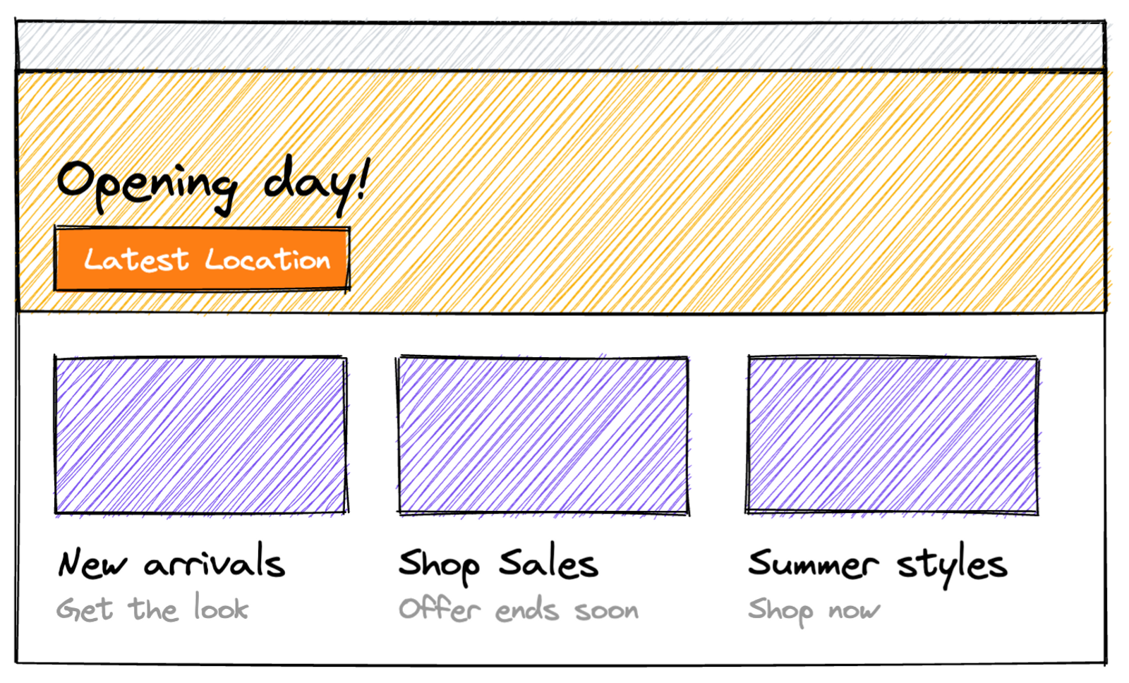
It's not hard to imagine a request comes in to swap the content of the first Card and the Hero.
Do we just send the props of a Card into the Hero? That's going to be disorienting for our author, especially in a "headless" editing environment.
// Deliberately awful code example
export default function Yikes({ hero, cards }) {  return (    <>      <Hero {...cards[0]]} />      <Grid>        {[hero, ...cards.slice(1)].map((cardOrHero) => (          <Card {...cardOrHero} />        ))}      </Grid>    </>  );}
Does our author have to copy-and-paste content between sections? What does that editing experience feel like?
And what if we need these changes not just today, but at a certain time, duration, interval, or based on a user’s intent or locale?
Our current layout is explicitly curated. It could instead be algorithmic or even self deterministic.
Just like our design system takes responsibility for what a “Primary Button” looks like, why not let our content model take responsibility for choices in components and layout?
Aim to shift your thinking from components to content.
Let’s look at our example again. Does the content in these components actually share a common purpose? Let’s name them accordingly. We’ll settle on “Promotion” for the content of every element in this layout. (Feel free to bikeshed that name among yourselves.)
We can now use a single data structure for all these layouts.
{ "promotions": [ { "title": "Summer Styles", "image": "https://cdn.image.service/summer-styles.jpg", "linkText": "Shop now", "linkUrl": "/shop-now" }, { "title": "New Arrivals", "image": "https://cdn.image.service/new-arrivals.jpg", "linkText": "Get the look", "linkUrl": "/new-arrivals" } // ... and so on ]}And instead of determining that a hero exists with explicit curation — we’ll move towards implicit curation for the hero by making it the first “Promotion” in the array.
This way our author can promote a "Promotion" into the hero just by changing the order of the array items.
export default function Promotions({ promotions }) {  const [hero, ...rest] = promotions;
  return (    <>      <Hero {...hero} />      <Grid>        {rest.map((promotion) => (          <Card {...promotion} />        ))}      </Grid>    </>  );}
We’re still authoring separate Hero and Card components to display these of course, but we only need to query one consistent data shape to populate them.
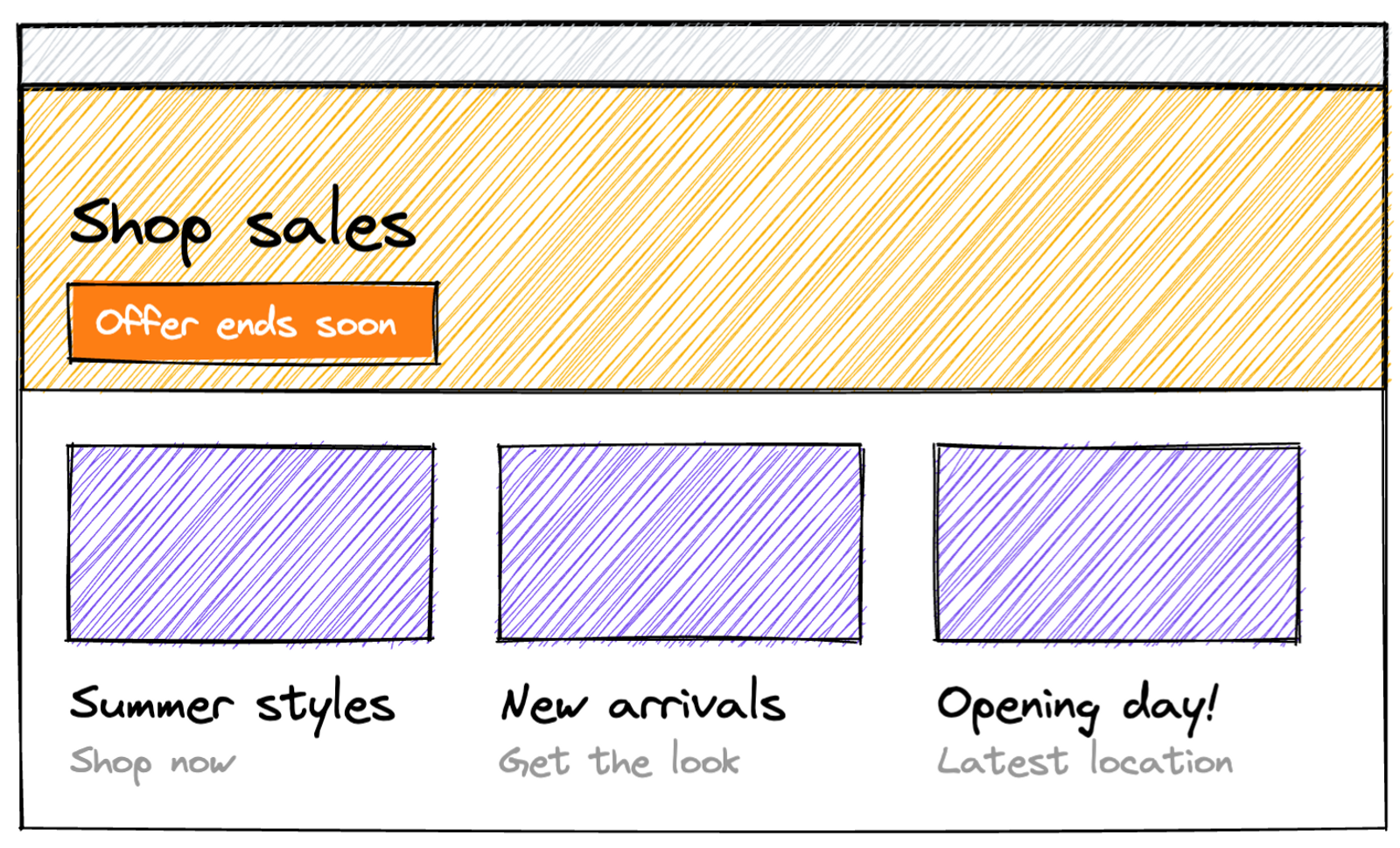
Let’s go further! Since the arrangement of our visuals are no longer strictly curated, they can be easily personalised not just by authors, but by logic!
const [hero, ...rest] = cleverPrioritySortingFunction(promotions);The primary item on the page might now be determined by where we are…

Or what we're most interested in…

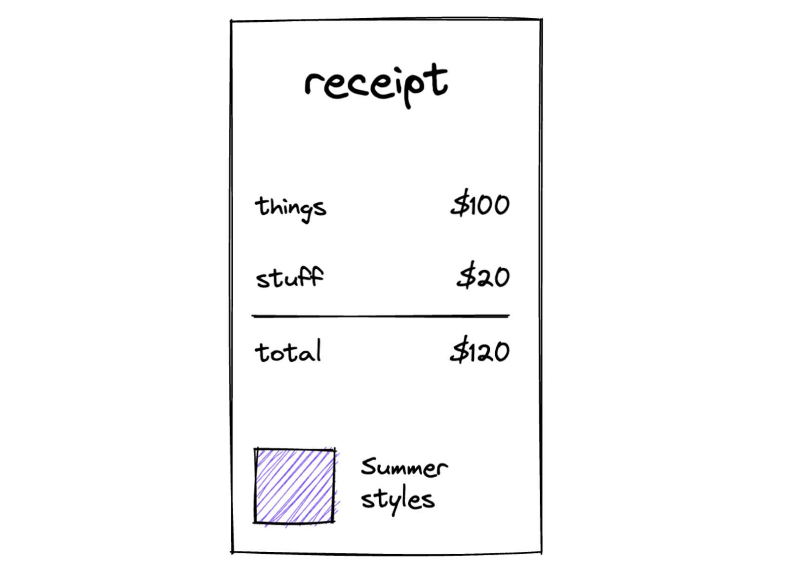
Better yet, our display-agnostic data is reusable outside of a website — without having to parse-out website specific syntax.

Lastly, our content model now conveys meaning even when it is devoid of content. A “Promotion Title” is well, the title of a promotion! Again, in a well modelled schema for structured content, the model itself conveys meaning before it is even populated with content.
This is common. Authors will request direct control over visual layouts. And with the right editing tools, that is a level of control you can absolutely create.
However, it may be that by involving authors in the process sooner — and seeing together the benefits of flexibility that structured content brings – could reduce the reliance on direct control over layout.
An author may be willing to surrender the ability to explicitly curate if they also gain:
Display-first thinking empowers developers and designers but can leave content authors — those that will continue to populate those components long after you've moved on — feeling like an afterthought.
Try to include some content-first decision making into the process. Especially before the first sketch is drawn or lines of code are written.
You might not get all the way to Netflix's machine learning driven personalised thumbnails. Just start moving in the right direction.

On the scale of layouts composed with components, move away from "explicit curation" and towards "content driven".
Ask yourself: